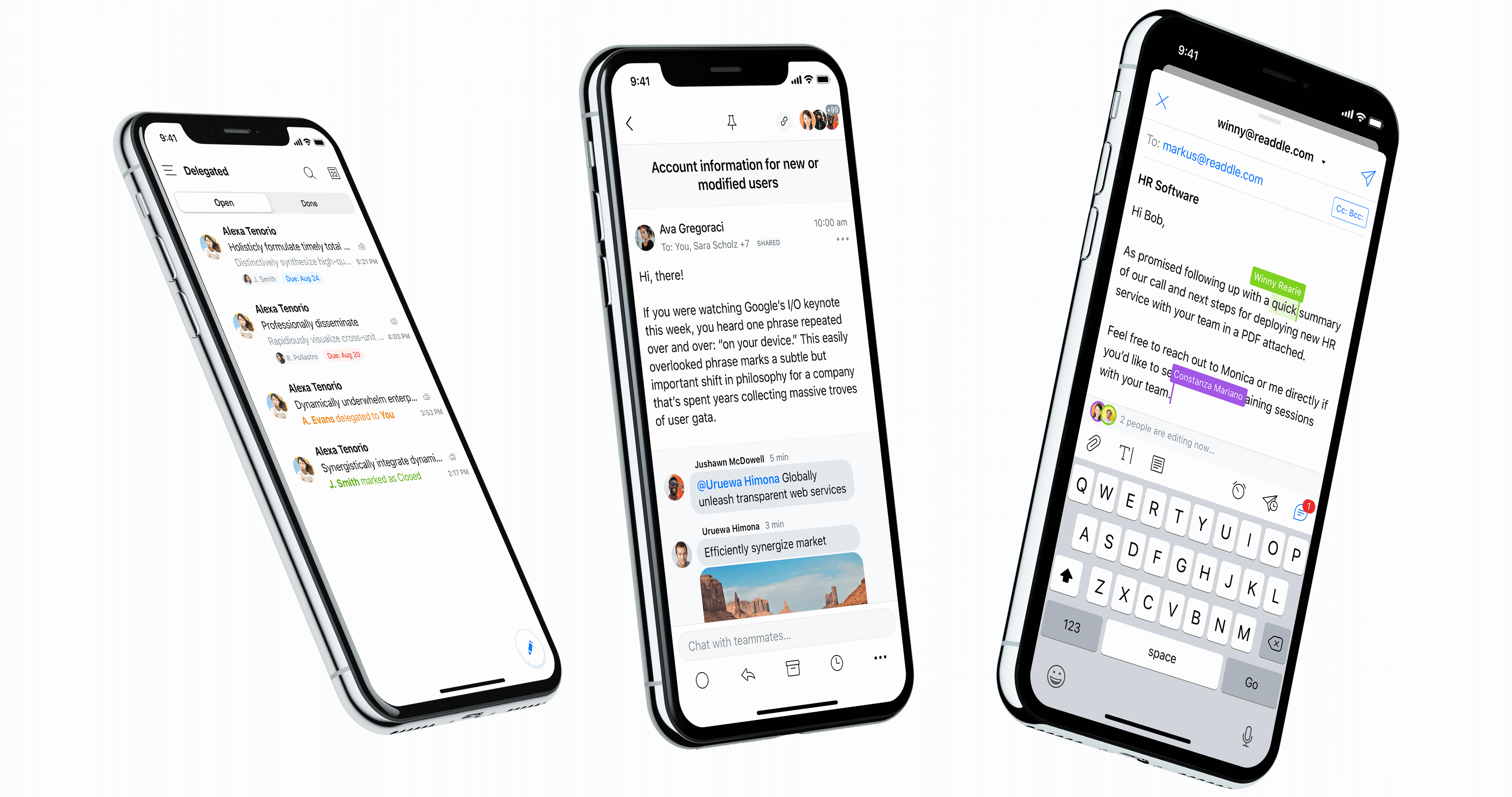
Spark, the popular email app from Readdle, has been redesigned on iOS and Android. The interface has always been a bit busy in the mobile app. That’s why the updated app now features a cleaner design and a handful of new features.

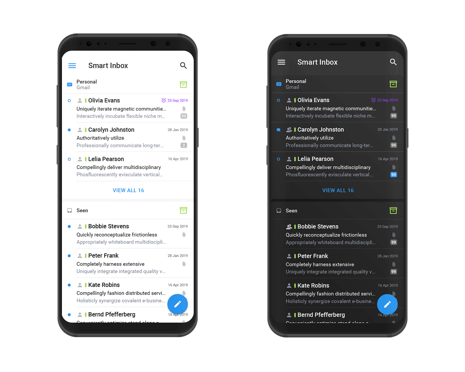
On the design front, Spark now uses simple headers to separate smart sections, such as newsletters, notifications and personal emails. It looks better than the rounded boxes with a colorful background.
There’s a lot of whitespace now, but the company has also taken advantage of this update to add dark mode. When you tap on a thread, the thread view has been updated as well.

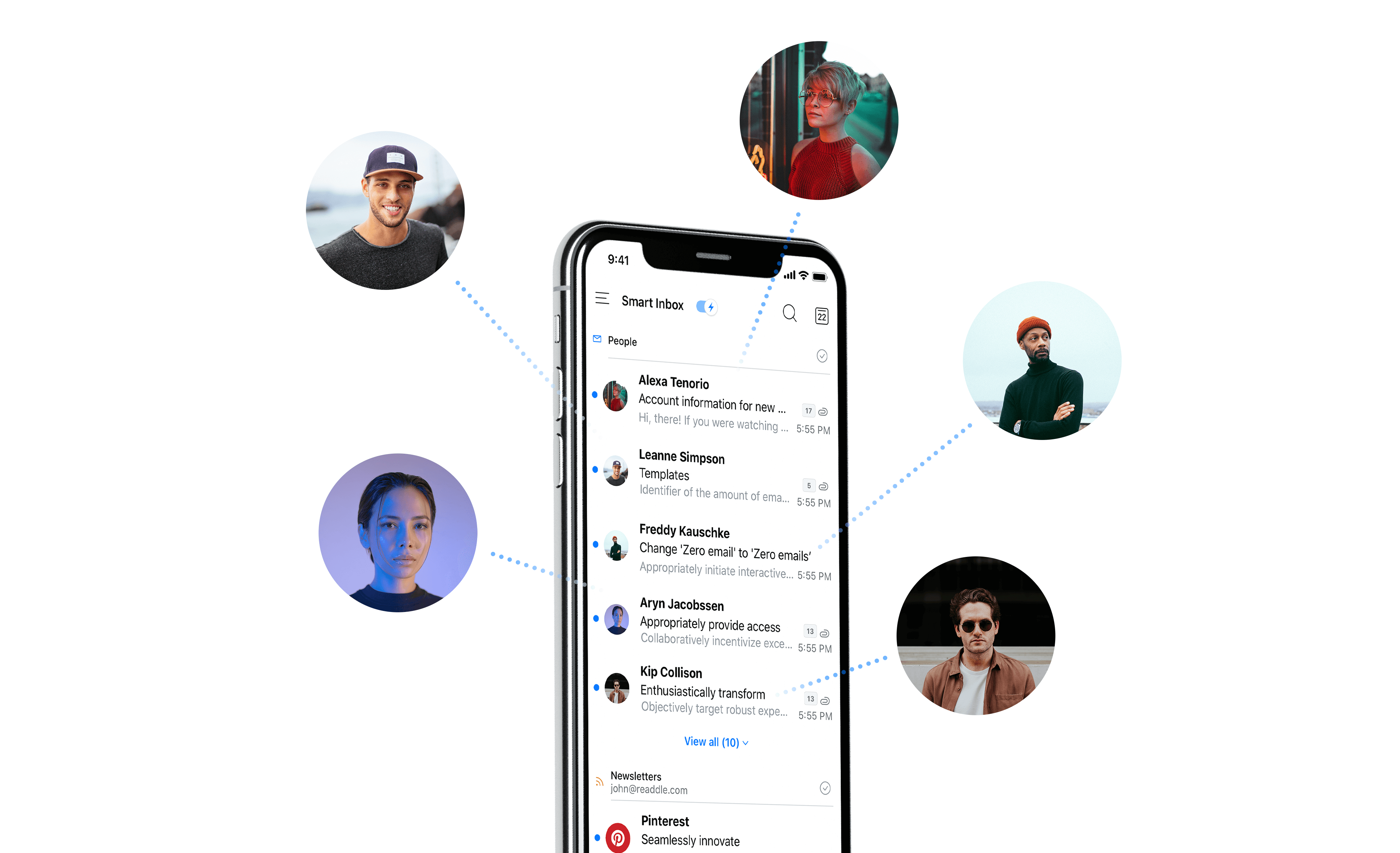
When it comes to new features, the app tries to autopopulate your inbox with profile pictures. Just like Vignette, it pulls images from popular web services. For instance, if somebody who emails you has a Twitter account under the same email address, Spark can add the Twitter profile picture to your inbox.
Everybody has their own way of dealing with their email inbox. That’s why Spark lets you choose the buttons that appear at the bottom of an email thread. For instance, if you use folders a lot, you can put a folder button. But if you want to replace that button with a snooze button, you can.
Spark is now a better citizen on iPadOS 13. You can open multiple instances of Spark. This way, you can work on a document with an email thread using Split View and you can open a second Spark window to check your inbox in a separate workspace. Spark on iPadOS also supports the floating keyboard and new iPadOS gestures.

from Startups – TechCrunch https://ift.tt/2KFgUC7
via IFTTT
No comments:
Post a Comment
Thank You for your Participation