Bootstrapped tech company Doist, the company behind popular task management Todoist, is releasing a major update called Todoist Foundations — the update should be rolled out over the next 24 hours. As the name suggests, it lays foundations for many new features down the road.
But there are already some interesting improvements. Task lists in Todoist don’t have to be an endless list of checkboxes anymore. You can now create sections in your projects. You can then move tasks from one section to another, collapse sections when you don’t need to see them.

Down the road, those sections could play a bigger role. For instance, a project could have sections representing multiple steps to achieve a task. You could imagine other views that let you move a task from one step to another.
When it comes to labels, they are now sorted in two categories — your personal labels and shared labels with other coworkers.
Todoist has also added a new task view on desktop and mobile that centralizes everything you can do related to a task. You can modify the due date, the priority level, see comments, add labels and more. Even better, you can see all the subtasks associated with a specific task in this new view.

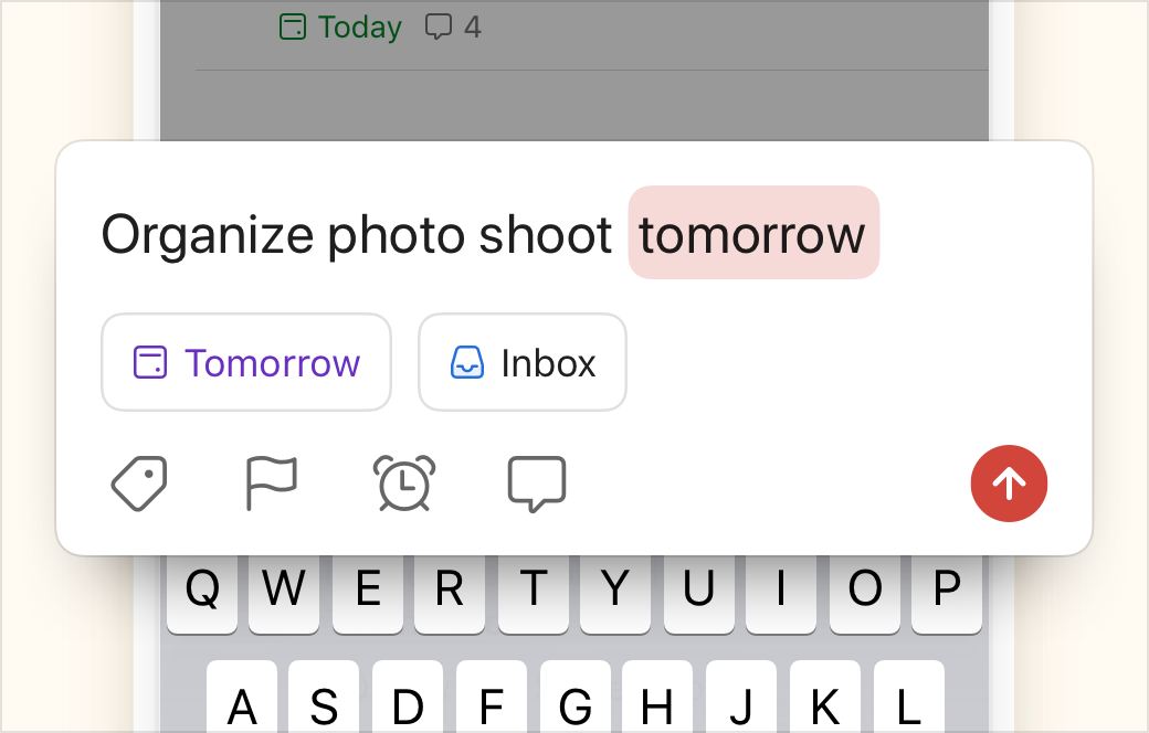
When it comes to mobile-specific improvements, the quick add bar has been overhauled. Quick add has always been one of my favorite features in Todoist. For instance, you can type “Send contract tomorrow at 9am @bestclient #work” to create a “Send contract” task in the “work” project, with a due date and the label “bestclient”.
Todoist first added buttons on mobile to surface those features and make them more intuitive. The company is simplifying the bar as it got really busy. It now displays existing due dates, projects and assignees in buttons directly. There are now fewer icons for less important features.
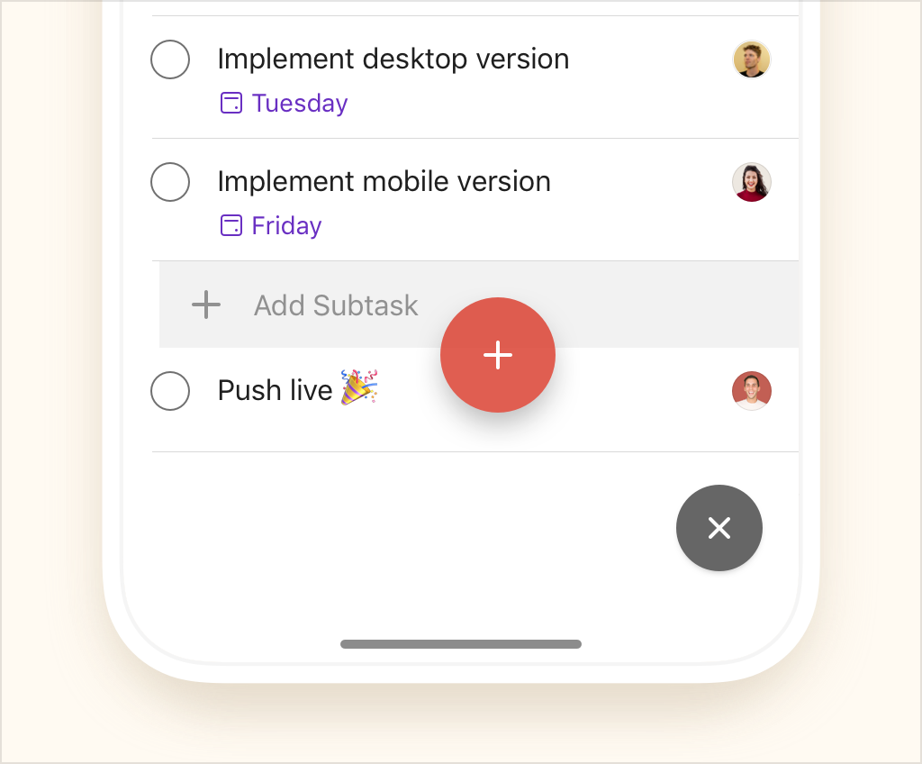
Todoist also borrowed a feature from Things 3 with the plus button. You can now drag and drop the plus button anywhere in a list to add a new task in the middle of the list. That feature is incredibly useful.
Behind the scene, everything should be faster as well. Finally, Todoist updated icons and its color palette.

from Startups – TechCrunch https://ift.tt/2MyT24u
via IFTTT
No comments:
Post a Comment
Thank You for your Participation